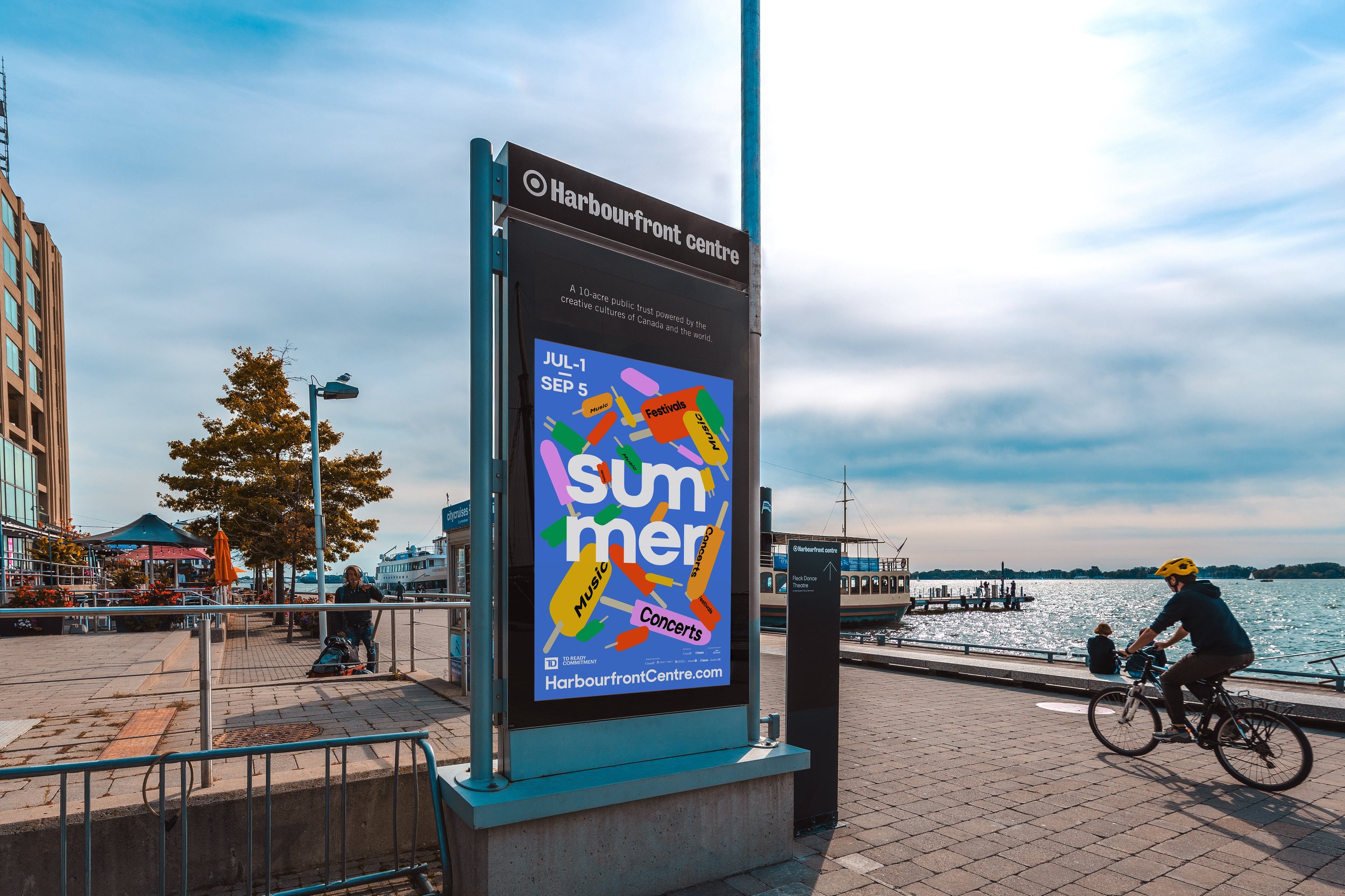
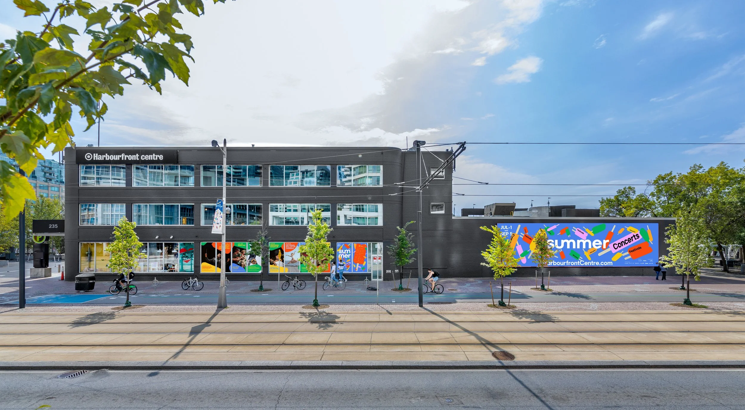
Summer at Harbourfront
Imagine the vibrant convergence of cultures at Toronto's core, enticed by lakeside beauty and diverse experiences. In my role crafting Harbourfront Centre's festival campaign, research revealed a unifying element: popsicles, beloved worldwide. Leveraging this insight, I conceptualized a visually compelling narrative. Typography gracefully wrapped around floating popsicles, symbolizing unity and the refreshing essence of summer. Essentially, the visual identity became an invitation for everyone to immerse themselves in the enriching experiences of Harbourfront Centre's summer festival.