
Brand Identity Refresh and Event Design System
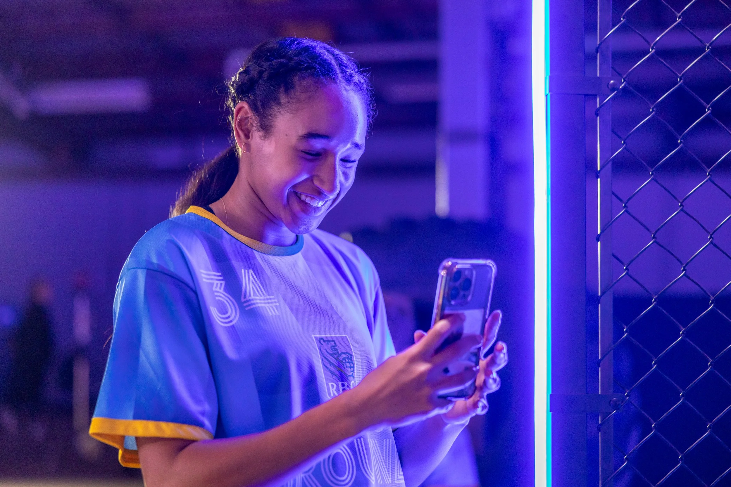
For the 2024 national rollout of RBC Training Ground, I led the refreshed brand identity and visual design system. Inspired by the visual language of sport — from jersey patterns to bold gradients — the new look brought motion, energy, and clarity to the entire experience. From identity to environmental execution, every detail was crafted to push the athletic ambition of the program forward.

The new identity was grounded in a pattern built from the RBC Shield outline, repeated to create a gill-like rhythm. This texture echoed movement and breath — essential to athletic performance — and alternated between RBC’s two primary blues.
Drawing from the design DNA of soccer kits, I used layered gradients, subtle grain, and dynamic contrast to bring a tactile feel to the visuals. The shield pattern became the backbone of the system, appearing on uniforms, backgrounds, and printed materials, giving the brand energy and cohesion without overwhelming it.
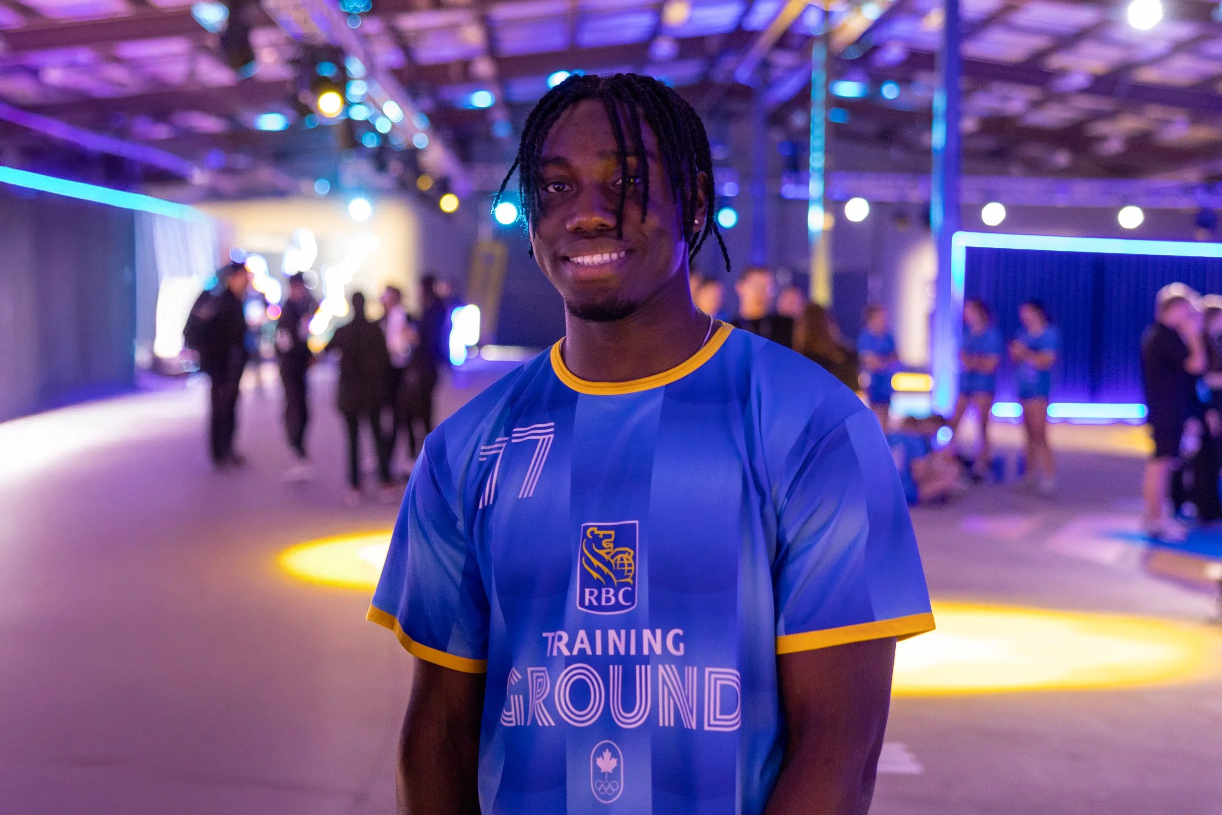
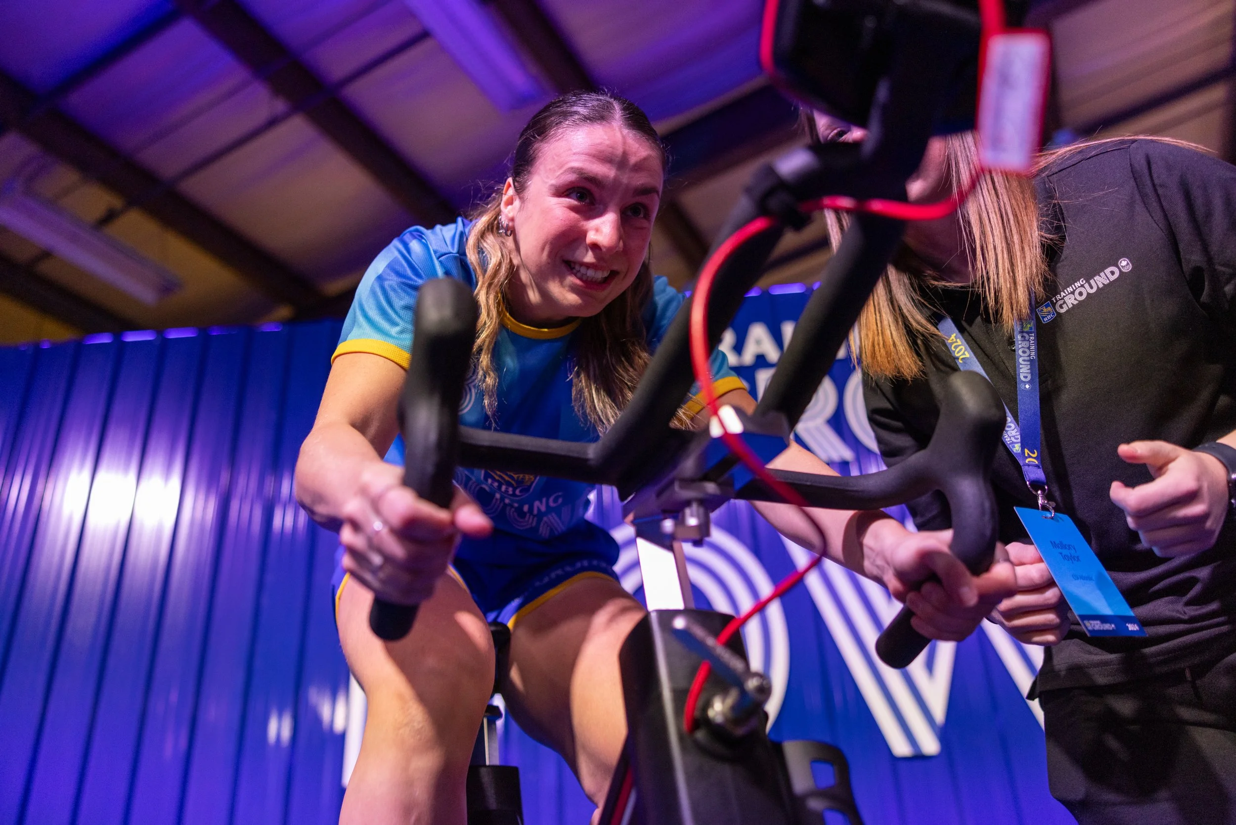
The pattern system extended across the entire athlete journey. I designed a full suite of assets — everything from photo ops to environmental graphics to training station signage. Using the official Training Ground typeface and RBC Yellow industrial chevrons, we built a bold, directional system that worked both functionally and visually. Each training zone had its own signage package, including spot kits, directional wayfinding, and branded zones for measurement, testing, and recovery. Every touchpoint was designed to support clarity, performance, and visual impact in fast-paced athletic environments.


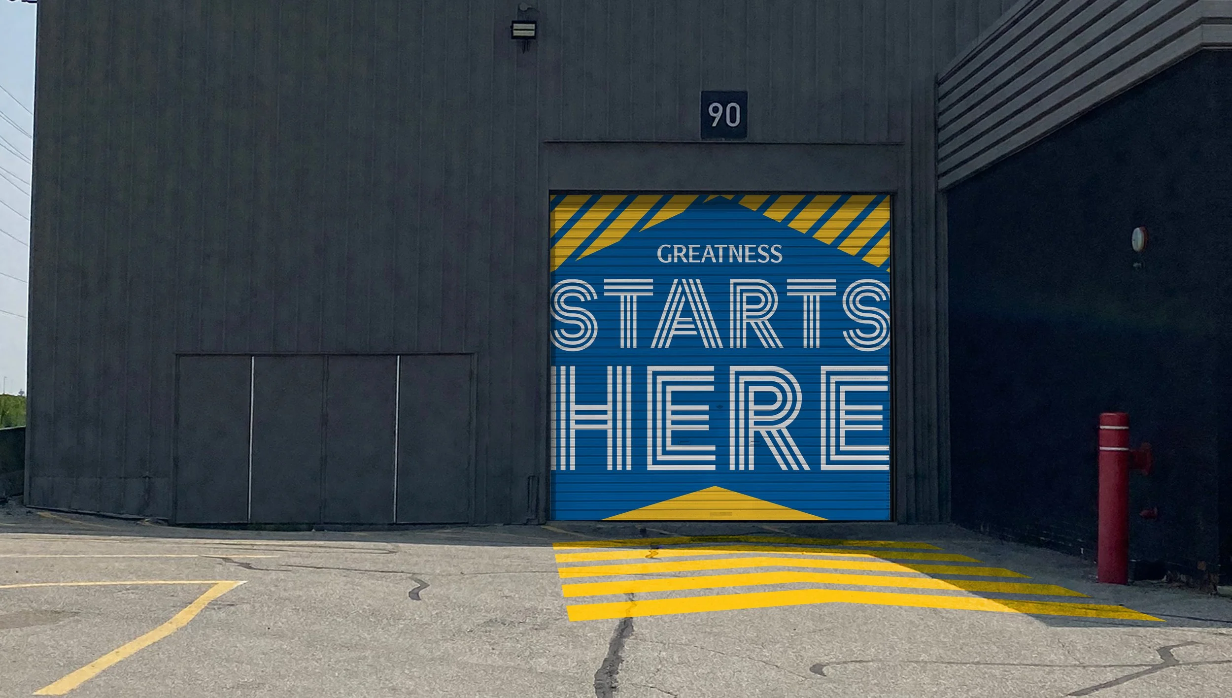
I collaborated with the 3D team to bring the design language into physical space. This included layout planning, environmental graphics, and material texture direction for things like barricades, podiums, and floor vinyls. The goal was to make the brand feel cohesive and immersive from every angle — from arrival to activation.